

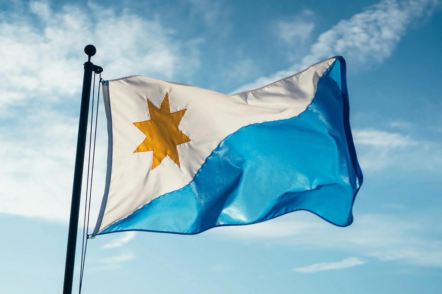
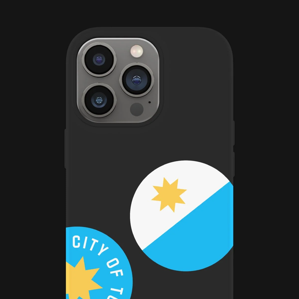
Download the Proposed Toledo City Flag
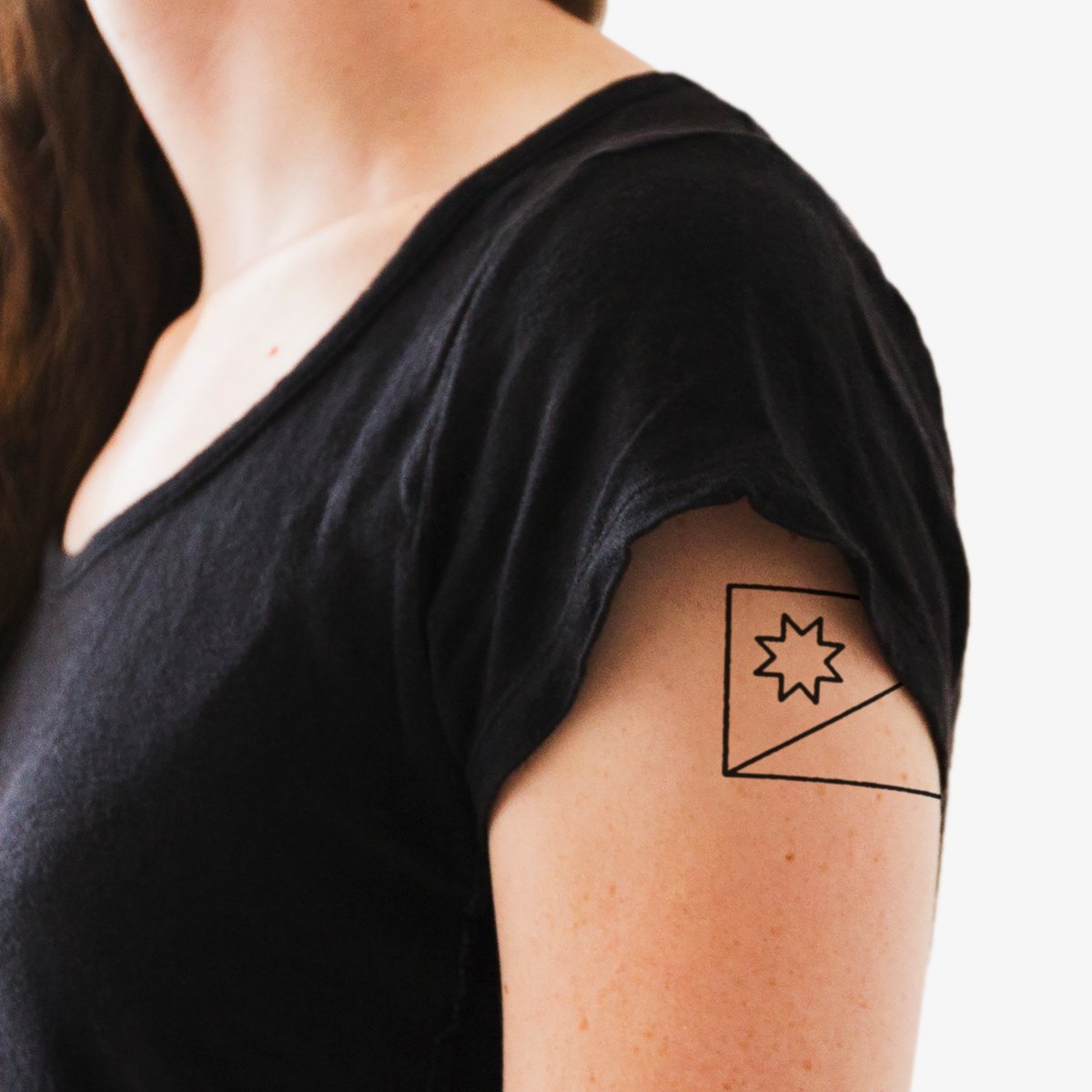
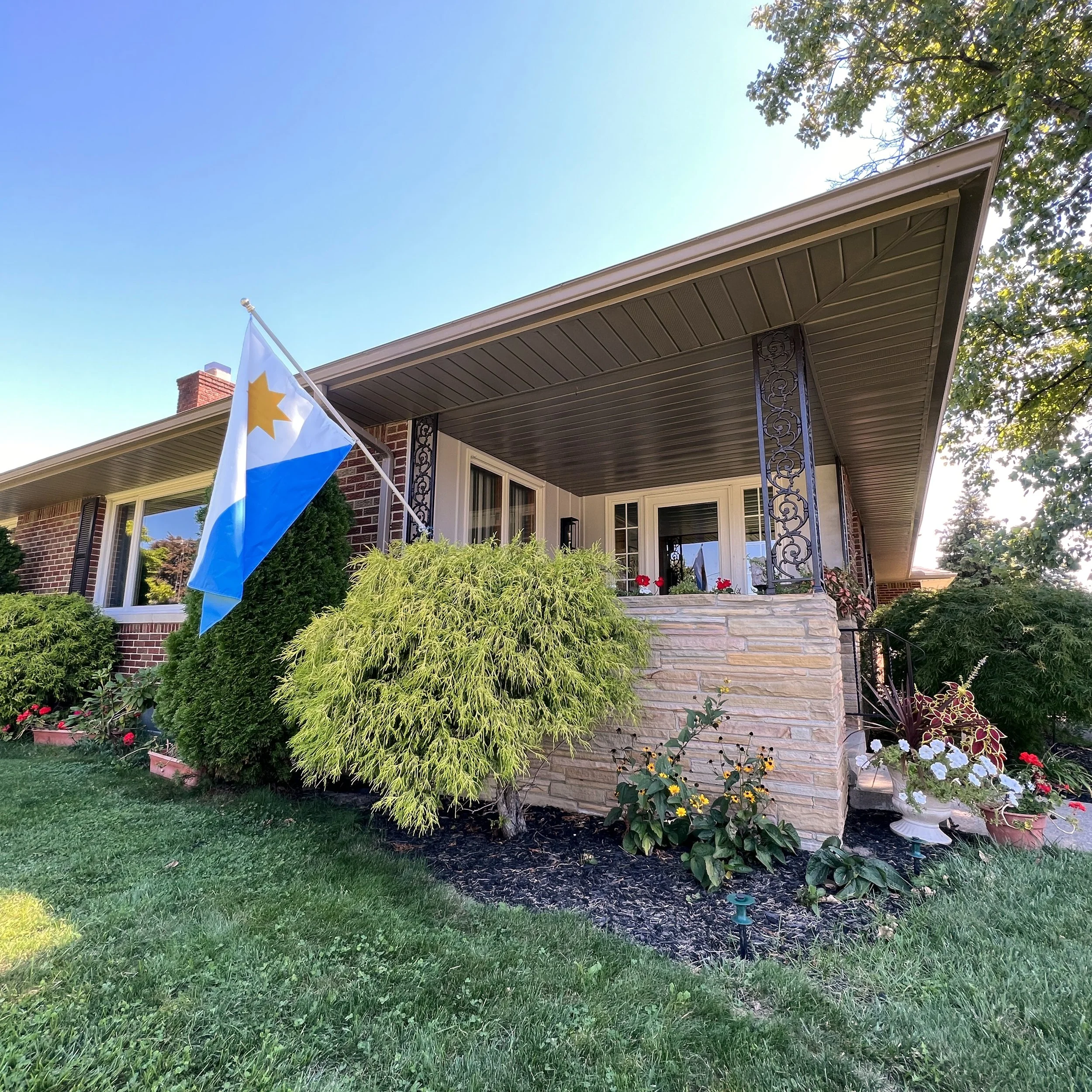
Make it Your Own
Express Your Hometown Pride
Download the Proposed Toledo City Flag Make it Your Own Express Your Hometown Pride
Something to Rally Behind
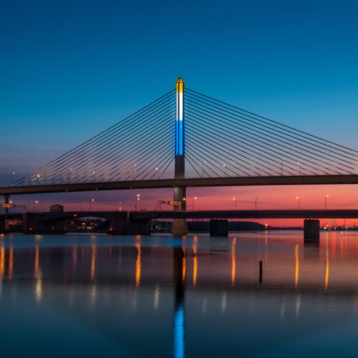
Photo: Scott Deca
Video: Chris
Hatfield
Reflag Toledo
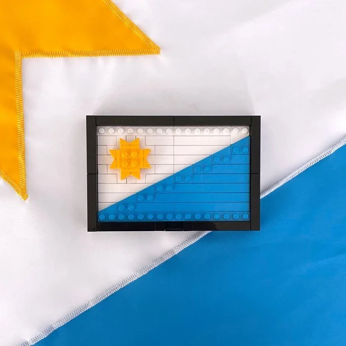
Flags are powerful, emotionally charged pieces of public design. They can inspire, spark conversation, and symbolically represent the communities that embrace them. After nearly 30 years since the Toledo City Flag was last considered, it’s time to reimagine.
Reflag Toledo is the culmination of over 6 years worth of hard work, research and design. After 5 years of development, the project was presented to city leadership, leading to an additional year of refinement, and community inputs. The final presentation to Reflag our city was given to Toledo City Council on August 9, 2022.
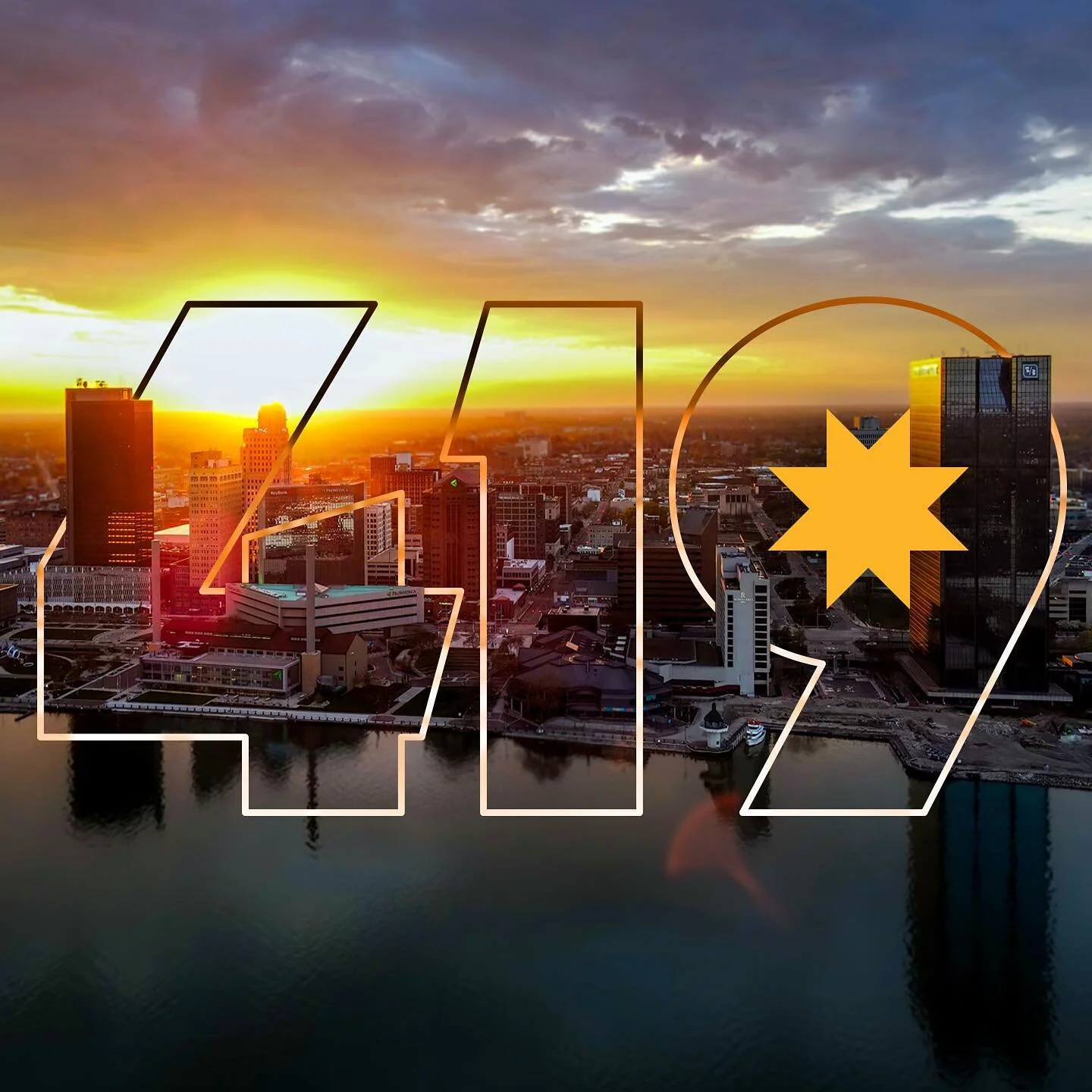
The City of Toledo has made incredible progress in recent years, and consistently showcases itself as a hard-working city on the rise. This redesign of the Toledo flag helps to continue that moment, engage the community, and further build local pride under one banner.

The Pitch
Several years of historical research and vexillological education results in a strong recommended design with rationale and vision for official adoption.
The Beginnings of Community Adoption
A good flag follows a set of standards in design and visual communication. But these standards are ultimately meaningless without substantial community adoption.
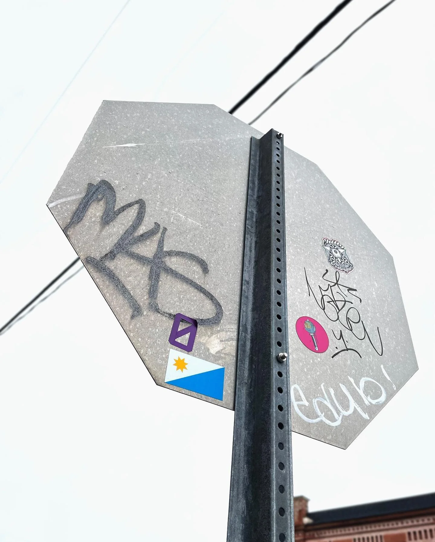
Any city flag in the U.S. is considered a publicly owned piece of design. This means that any person, entity, or otherwise can utilize the flag in new and interesting ways to communicate their civic pride. As part of Reflag Toledo, I was determined to imagine a number of forms community adoption could take, but I could only bring it so far. This is only the beginning, and I cannot wait to see where the community takes this flag.

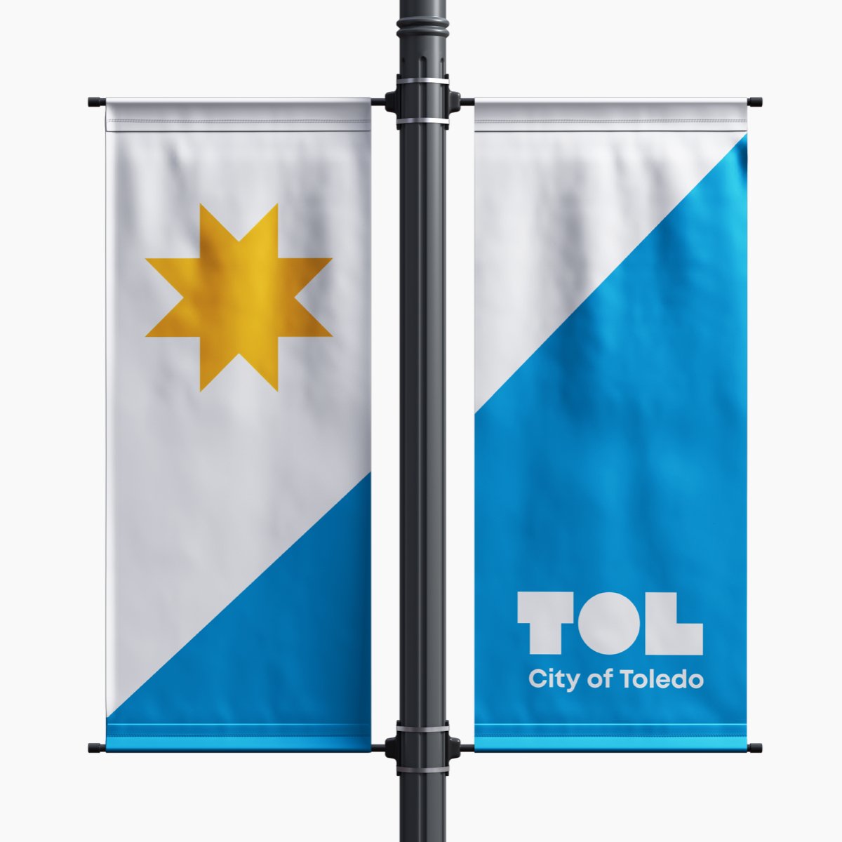

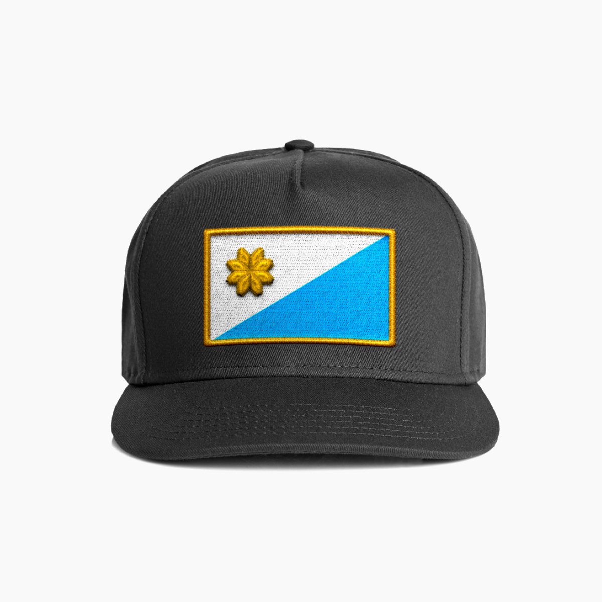


More About the Process
-
In 2015, I was inspired by an episode of the podcast 99 Percent Invisible by Roman Mars. The episode, Vexillonaire, detailed a high-level overview of flag design, why flags matter so much to people, and how U.S. cities seem to have a hard time adopting well designed meaningful flags. Mars later followed up this episode with an incredibly informative and entertaining TEDtalk, Why City Flags May be the Worst Designed Things You Never Noticed. From there, I was hooked.
Over the course of 5 years, I spent a countless hours researching flag design, looking to the experts, and getting out of my own head as a more traditional "designer". Flag design is its own beast, and required much different thinking. In this time I also dug deep into Toledo history, and specific history about the flag today (which isn't even the original, fun fact!) After taking the time to get past a lot of self doubt, feeling confident in what I had learned, I then started gathering additional inputs from other artists, designers, community leaders and local institutions.
I compiled all my findings, historic research, educational content, and ultimately a recommended design with complete rationale and vision for adoption. This pitch deck amounted to over 80 pages. I worked to get this in front of the city, and pitched the idea. This was almost 1 year ago to the day.
This was not taken lightly, created on a whim, or intended to put myself out there in anyway, it was created out of my love for Toledo. Giving back to the city that has inspired me.
-
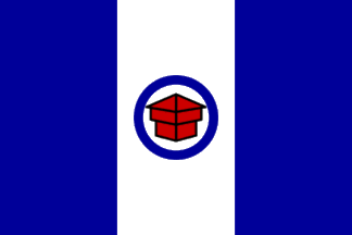
The original Toledo City Flag was adopted in 1909 during the administration of Mayor Brand Whitlock, along with an accompanying municipal seal. The original resolution passed by Toledo City Council detailed the flag adoption:
“The significance of the design is as follows: the block house representing old Fort Industry, which was the first settlement of Toledo, represents security and industry and that advancement which came of the pioneer spirit. The circle surrounding it denotes unity, completeness and eternity, and giving the sense of location, represents the state of Ohio. The colors of the flag are the national colors and stand not only for the nation, but the blue for constancy, the white for purity and the red for labor, courage and brotherhood.Be it further resolved that the device of the block house within the circle stand as the emblem of the City of Toledo and be the basis of all seals and devices representing the sovereignty of the city; with this addition, however, that where possible the date of the organization of the city, 1837, be added and the motto of the city, Laborare est Orare.”
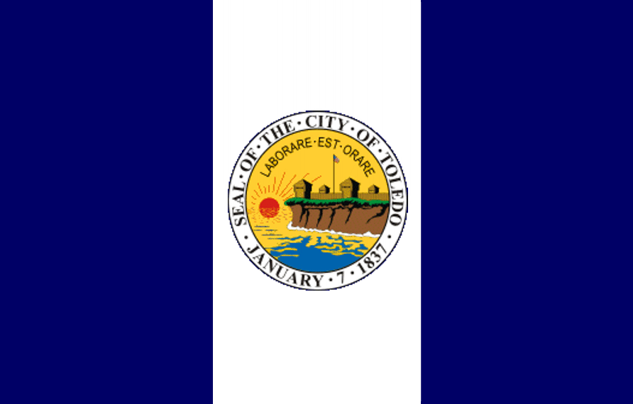
The flag and its seal counterpart represented the City of Toledo for nearly 90 years.In 1994, then Mayor Carty Finkbeiner proposed a change to the city seal in preparation for Toledo’s 160th anniversary. With a resolution passed by City Council, the seal was modified to reflect the original seal from 1873, celebrating Toledo’s history. The seal was redrawn, modernized, and colorized to peak early 90’s graphic standards. The resulting, far more complex 1994 city seal was adopted. Upon its adoption, the updated historic seal was placed at the center of the flag, replacing the iconic blockhouse of Fort Industry. This seal and Flag are still in place today.
Unfortunately the flag was not considered further before the seal was incorporated into the design. With the adoption of this flag and seal in 1994, Toledo largely lost the meaning and visual recognition of the Blockhouse. The flag is not widely flown, beloved or adopted by the community in any meaningful way. In fact, with its many colors and intricate detail, the flag is actually more expensive to produce than a simpler, more traditional flag, and is thus not even widely flown by the city representatives or institutions.
in 2020, the city seal was optimized, as part of the efforts to rebrand the city as a whole. While the subject matter of the seal remained, the design was cleaned up, simplified, and brought to a higher standard of visual communication. Now, because of this, each and ever Toledo City Flag is currently out of sync with the rest of the city, and far out of date. -
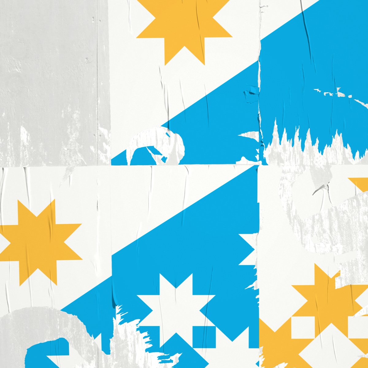
The 16-page Good Flag, Bad Flag, compiled by Ted Kaye from the expert wisdom of over 20 vexillologists/vexillographers, has become a classic resource for those wishing to design or re-design a flag. The booklet lays out five basic principles for good flag design, and then shows examples of flags that follow them and flags that disregard them, all illustrated in color.
These principles were carefully considered throughout the reimagining of Toledo’s flag. It provided the context to properly critique the current flag, and laid the foundation to create something with far more substance, meaning, and longevity.The Five Principles of Flag Design:
Simplicity
The flag should be so simple that a child can draw it from memory.Meaningful Symbolism.
The flag's images, colors, or patterns should relate to what it symbolizes.Basic Color.
Limit the number of colors on the flag to three which contrast well and come from the standard color set.No Lettering or Seals.
Never use writing of any kind or an organization's seal.Distinction / Relation
Avoid duplicating other flags, but use similarities to show connections.
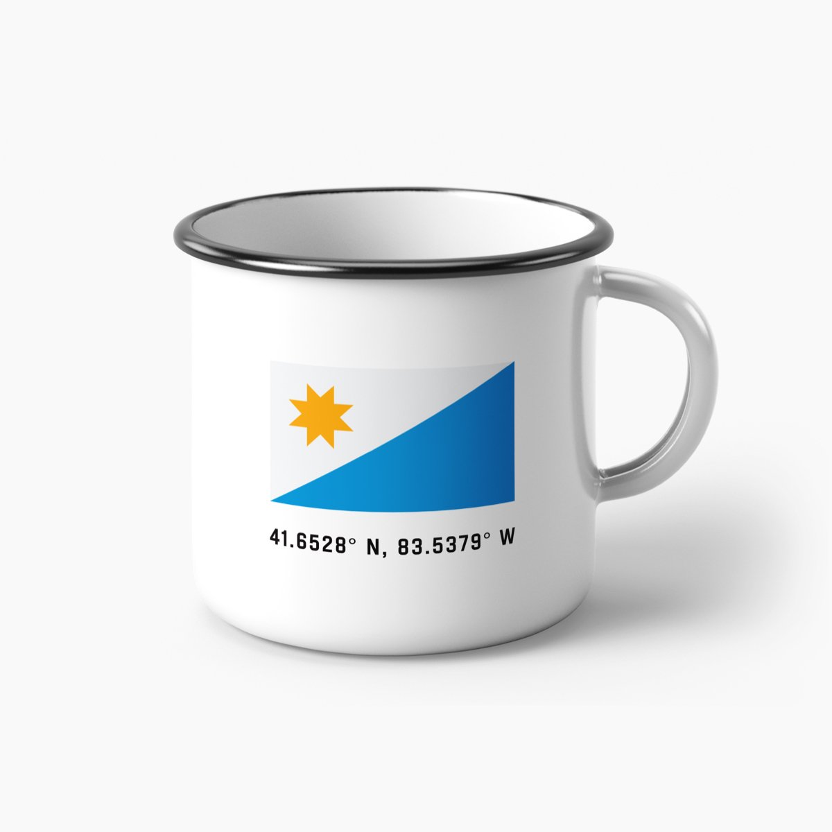
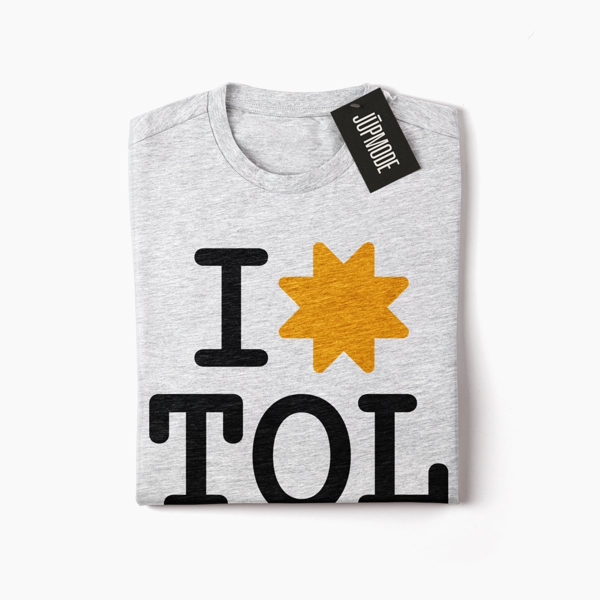
Get Your Toledo Flag Today!
The proposed Toledo City Flag is available for purchase now at Flags for Good.

