Trip’n Biscuits Brand Identity
Getting groovy with Toledo’s newest food truck
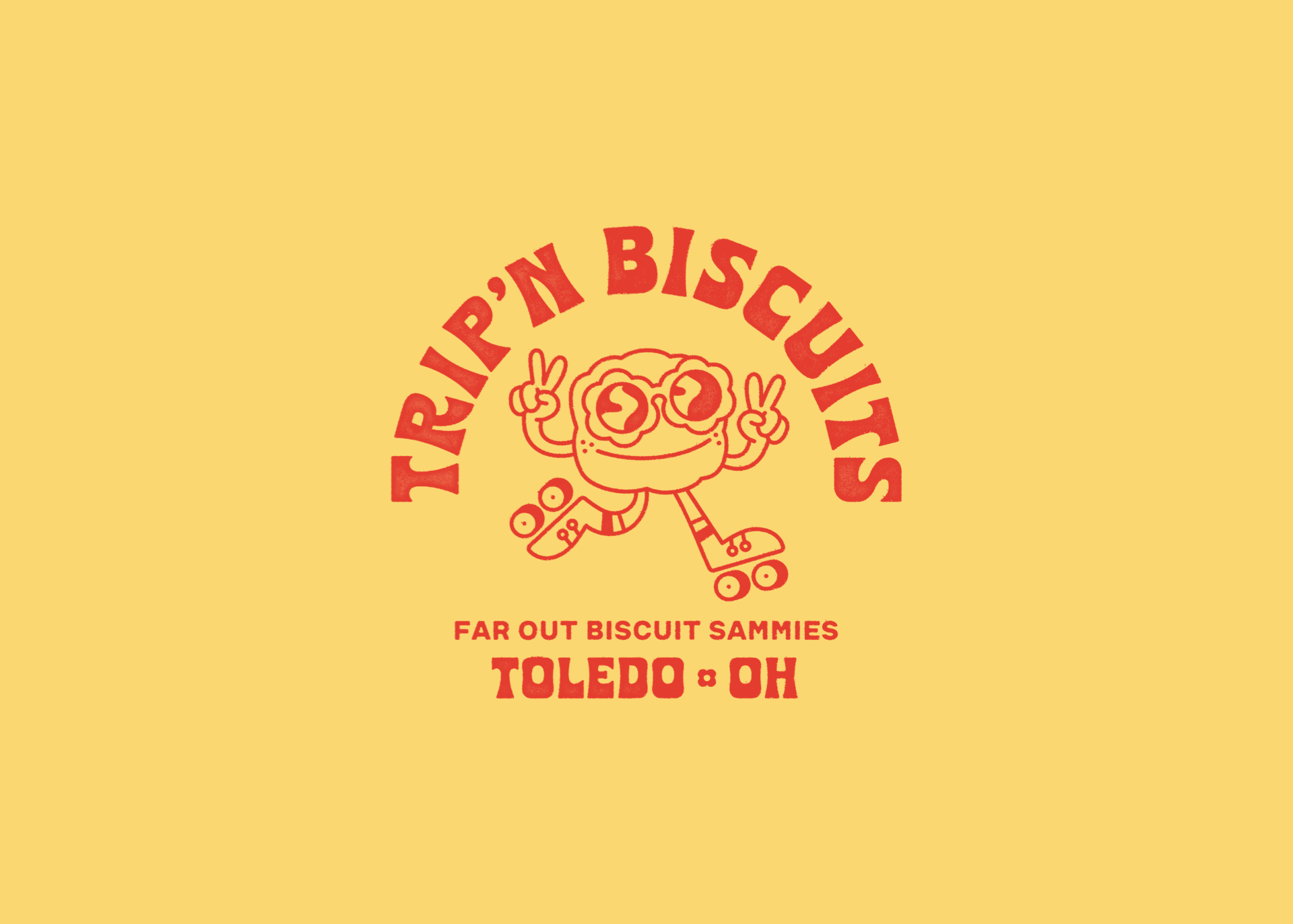
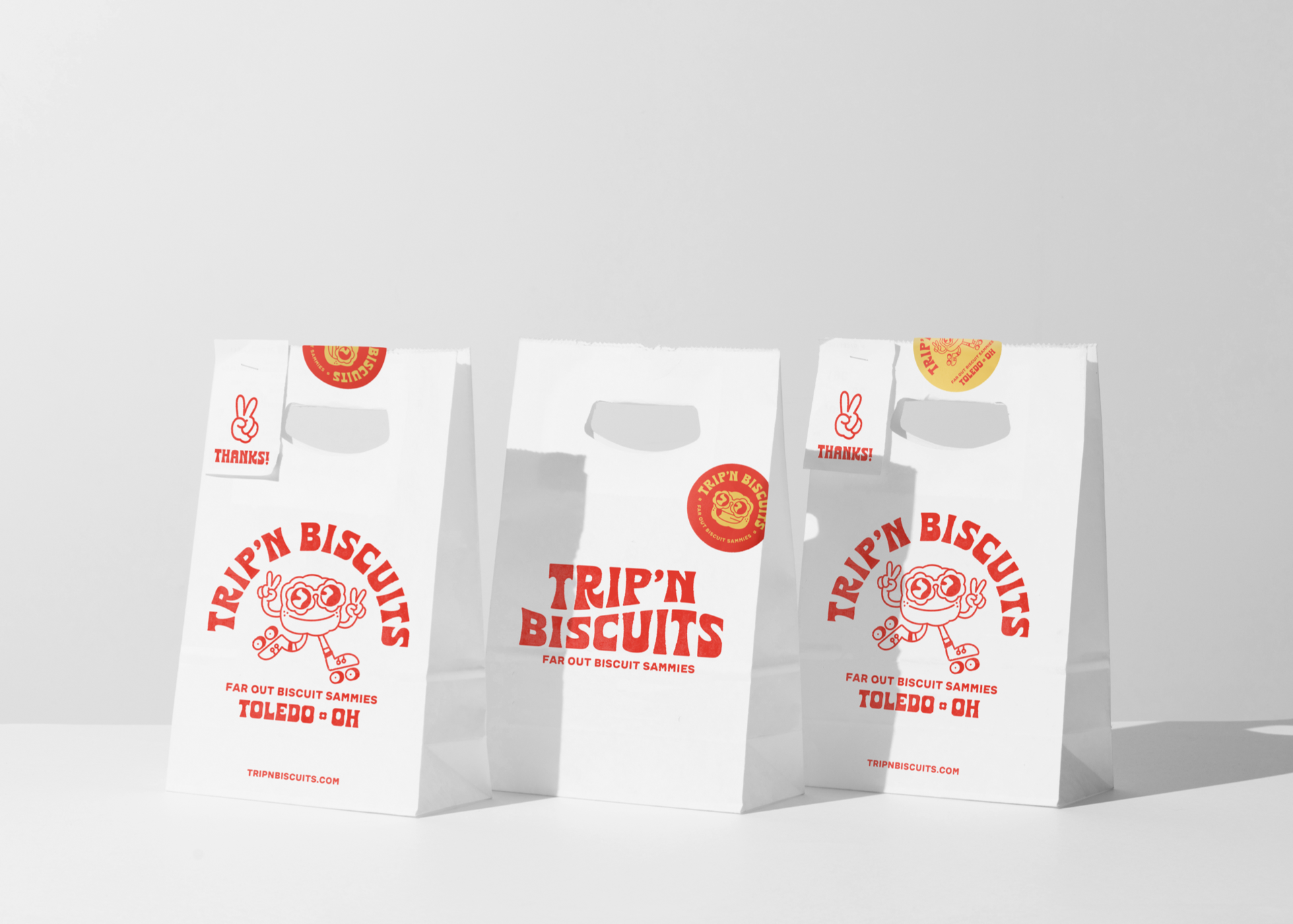
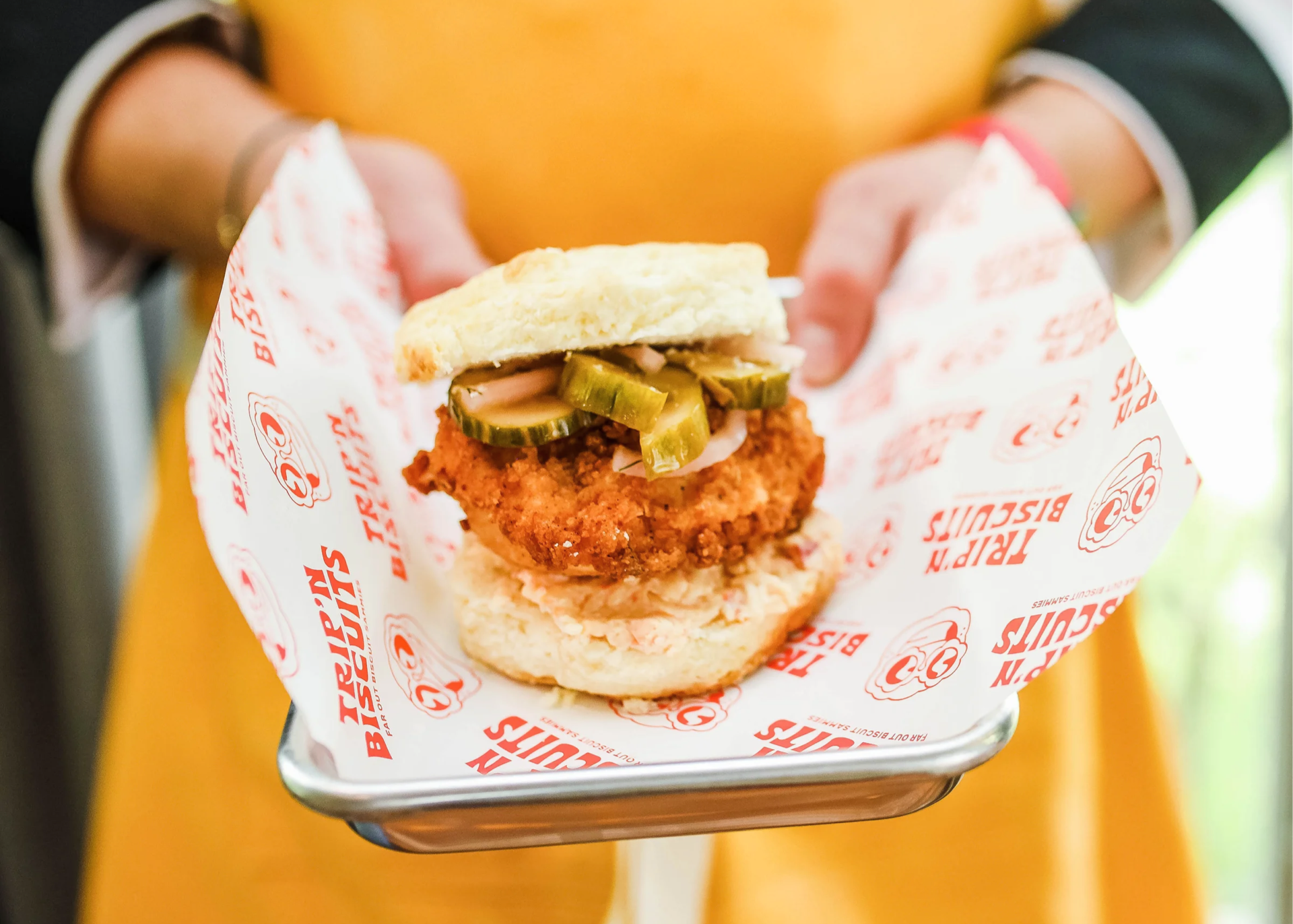
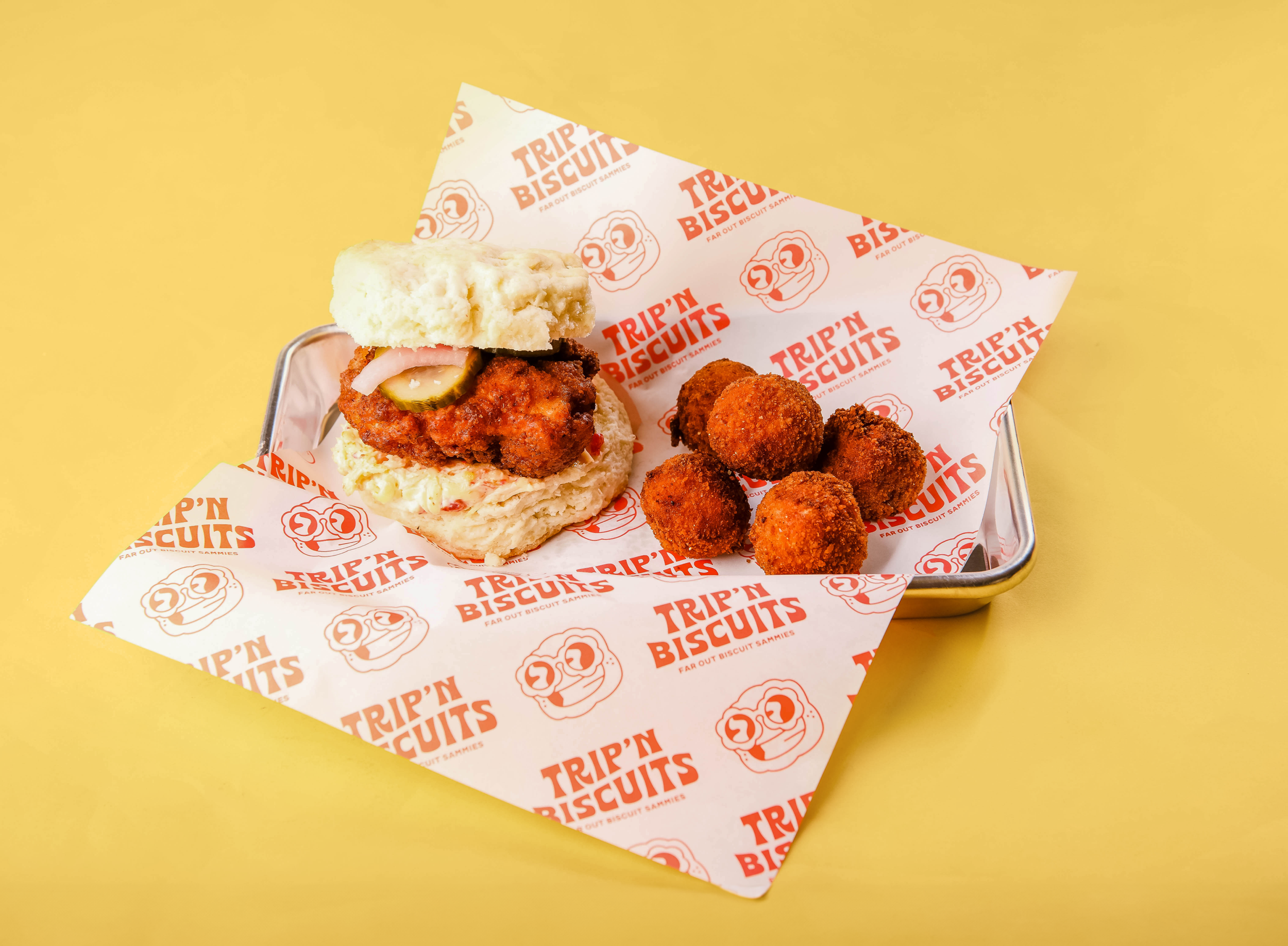
Trip’n Biscuits is bringing a fresh take on comfort food to Toledo, serving up biscuit sandwiches, biscuits and gravy, biscuit benedicts, and more. The owners already had an incredible name in place and wanted a brand that captured the fun, retro energy behind their vision.
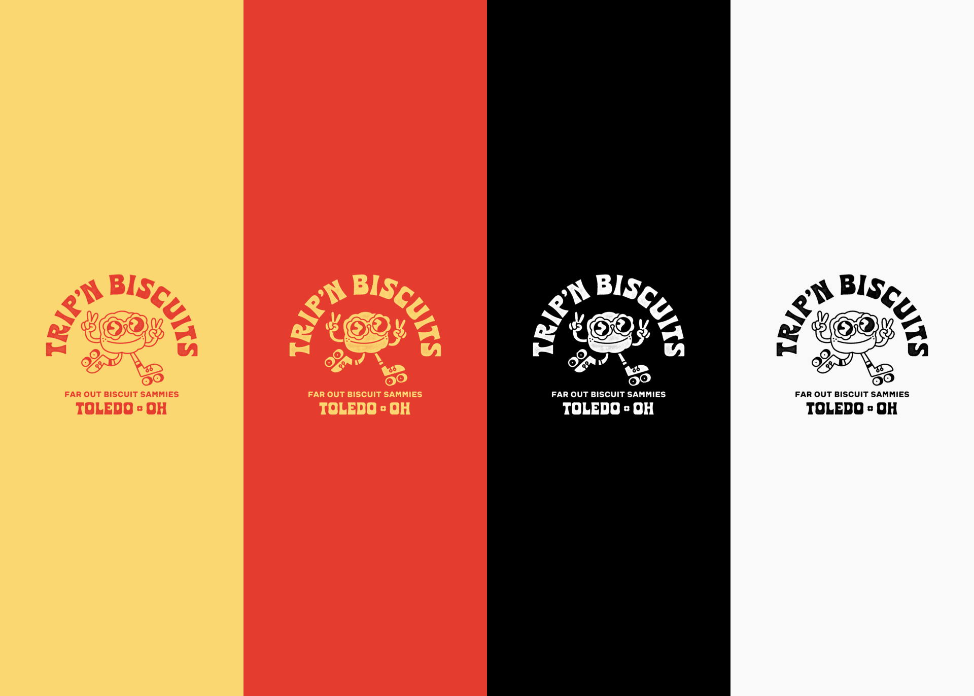
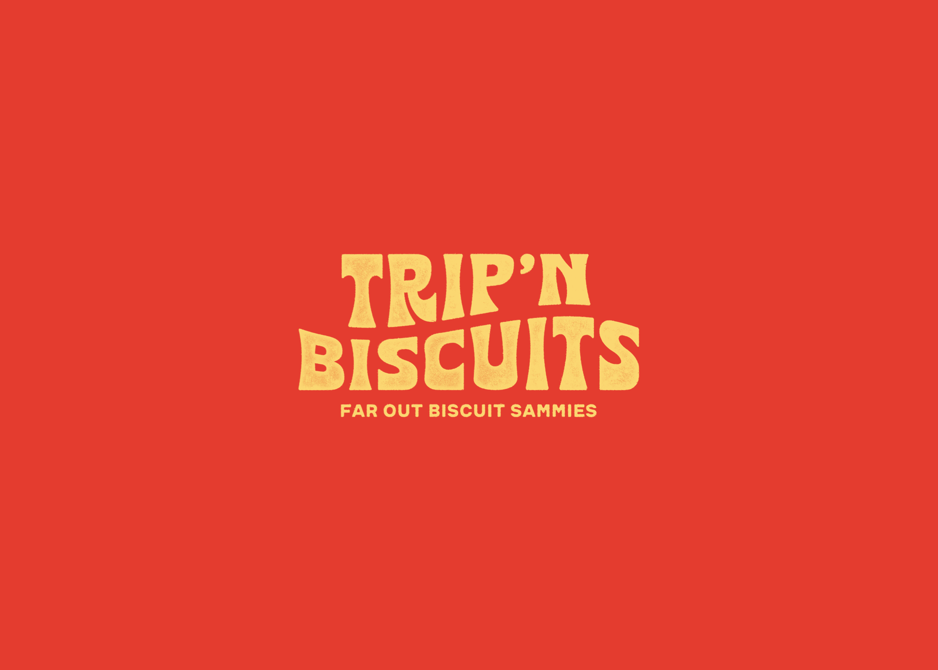
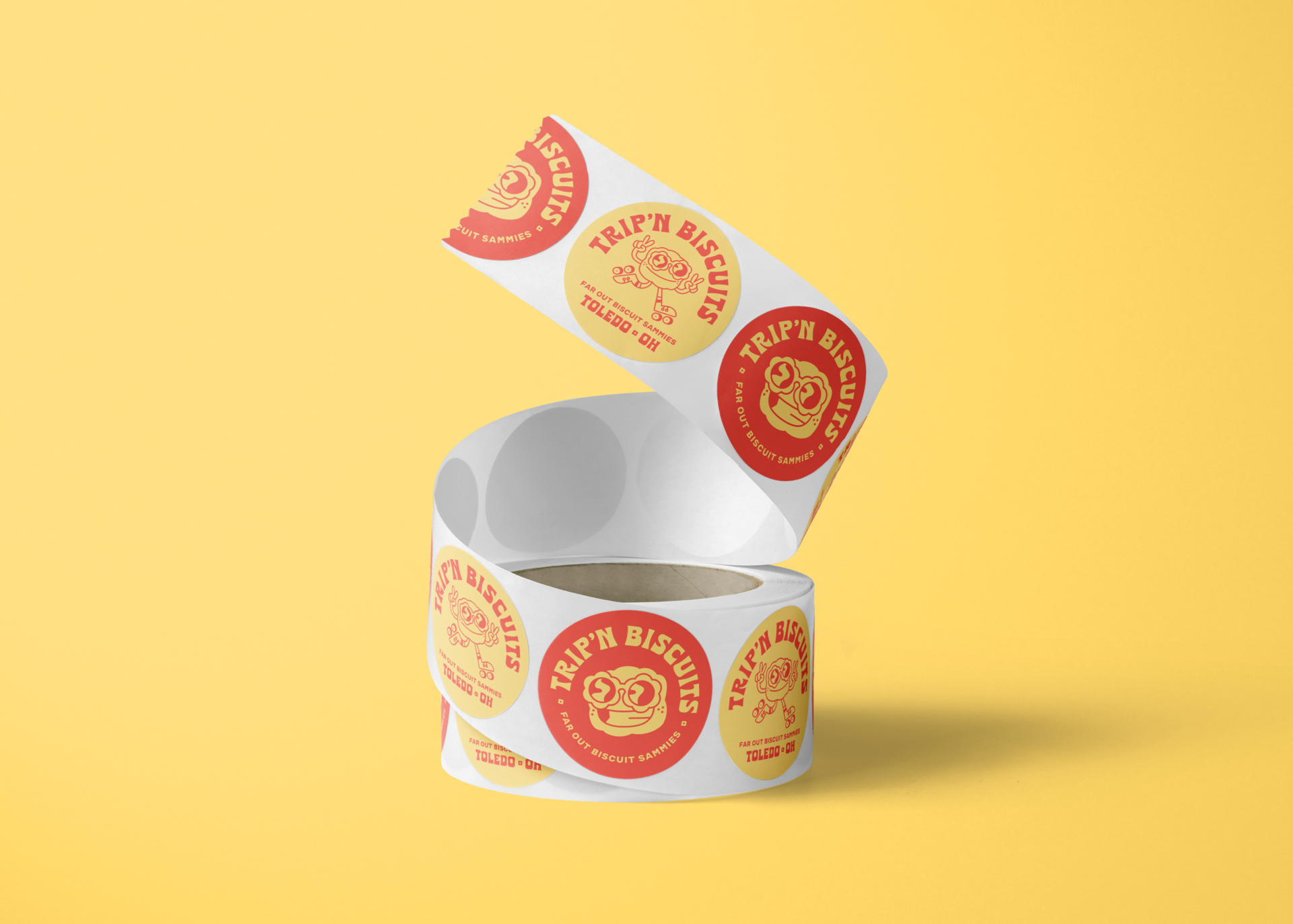
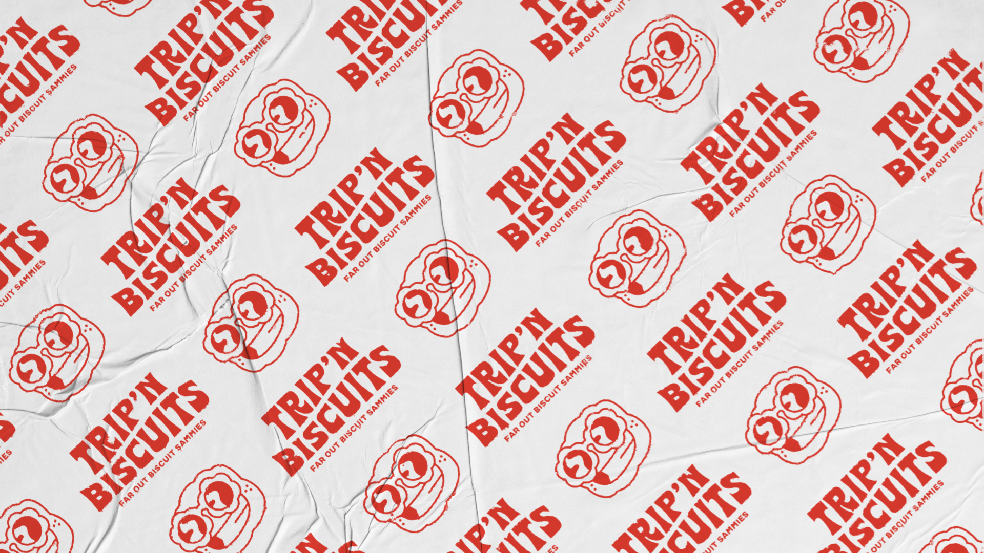
With such a bold name, the design had plenty of personality to work with. The typefaces Chronic Sans by Bretheryn Design Co. and SF Blunt were chosen to fully embrace the playful, 70s-inspired aesthetic. At the heart of the brand is Sam, a fun-lovin’ biscuit on wheels who spreads peace, love, and buttery goodness wherever he goes.
Trip’n Biscuits is out on the streets of Toledo today, serving up good vibes and great eats. Keep an eye out and grab a bite!